Before Tylt existed, I was designing TradingLeagues — a crypto-based trading product. We kept seeing the same failure: transactions dropping off not because of pricing or merchant tooling, but because customers couldn't add crypto to their wallets if they didn't already have one.
On the surface it looked like a customer onboarding problem. It wasn't. Every failed transaction was a merchant's revenue loss. Every abandoned payment was a support ticket, a reconciliation task, a customer they couldn't convert again.
The insight that shaped Tylt: merchant success was tightly coupled to customer crypto readiness — and that was a dependency merchants had no way to control. Tylt was built to break that dependency. Give merchants the infrastructure to abstract crypto complexity from their customers entirely.
Merchant revenue depends on customer crypto readiness — a dependency merchants had no way to control.
Merchant infrastructure absorbs customer complexity entirely. Crypto is invisible to the end user.
When Tylt was greenlit in August 2024, it had a product direction and a development team. It didn't have flows, navigation, IA, or a design language. As the founding designer, the job was to build all of it — fast enough to ship CPG by December.
The first decision I fought for: structure before aesthetics. The founders wanted to see what the product would look like. I pushed to lock flows, navigation, and layouts first — across the entire app — before touching visual design.
The 0→1 foundation I designed. CPG shipped at launch. Five more surfaces followed.
The platform was designed responsive from the start — desktop and mobile in parallel, not as an afterthought. Merchants needed desktop for operational workflows. Retail users were primarily mobile. Both had to feel native, not adapted.

With the product scope mapped, I built the information architecture around a single core loop: onboard → transact → track → repeat.
For the design language, I started with TradingLeagues as a scaffold — adapting its patterns to Tylt's context rather than starting from zero. Once the flows were stable, I studied how established fintech products handled clarity at scale — apps known for making financial complexity feel approachable. Tylt's visual direction grew from that research.
For P2P specifically, I went further. I used two leading P2P trading platforms personally — as a real user, not just a researcher — to understand how P2P trading actually felt under pressure before designing it.
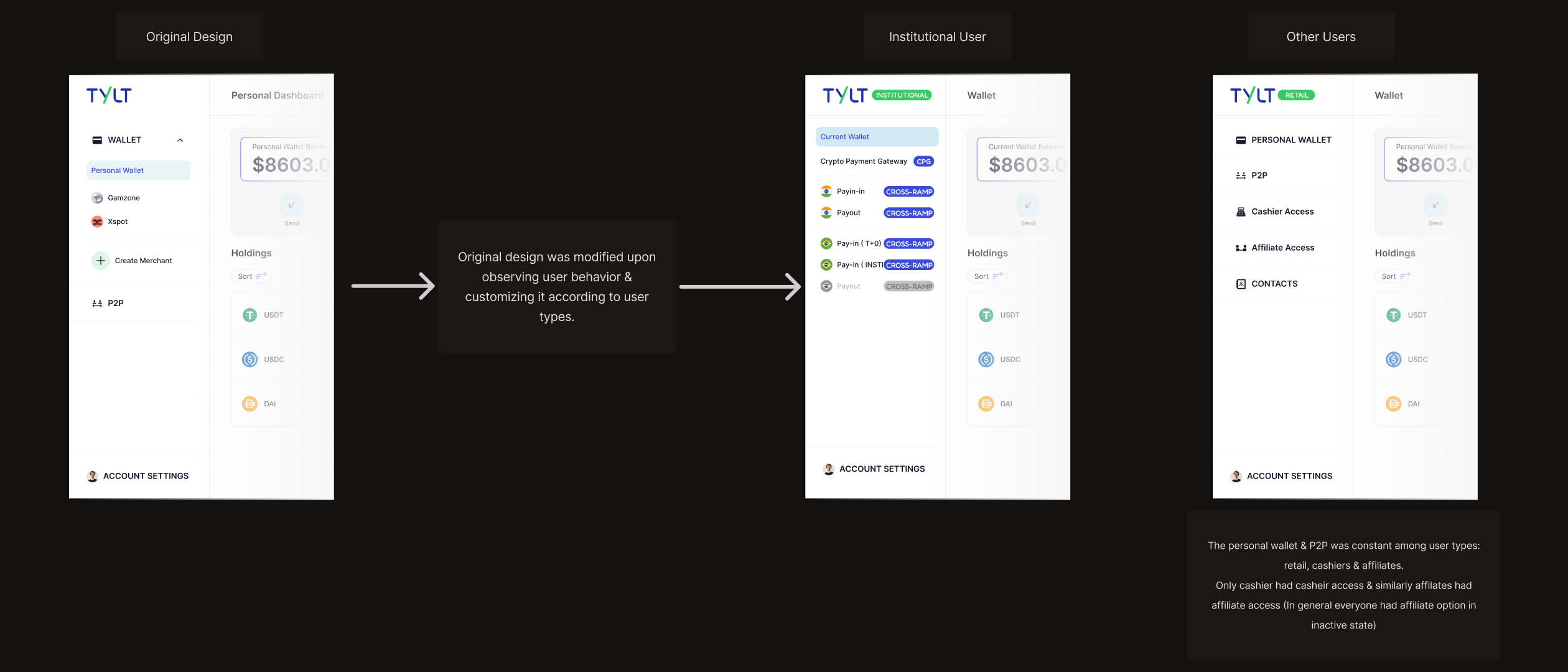
One onboarding flow → three
We launched with a single onboarding flow for all users. As the product matured, different user types had fundamentally different needs from the moment they signed up. We rebuilt onboarding to bifurcate by account type at entry.
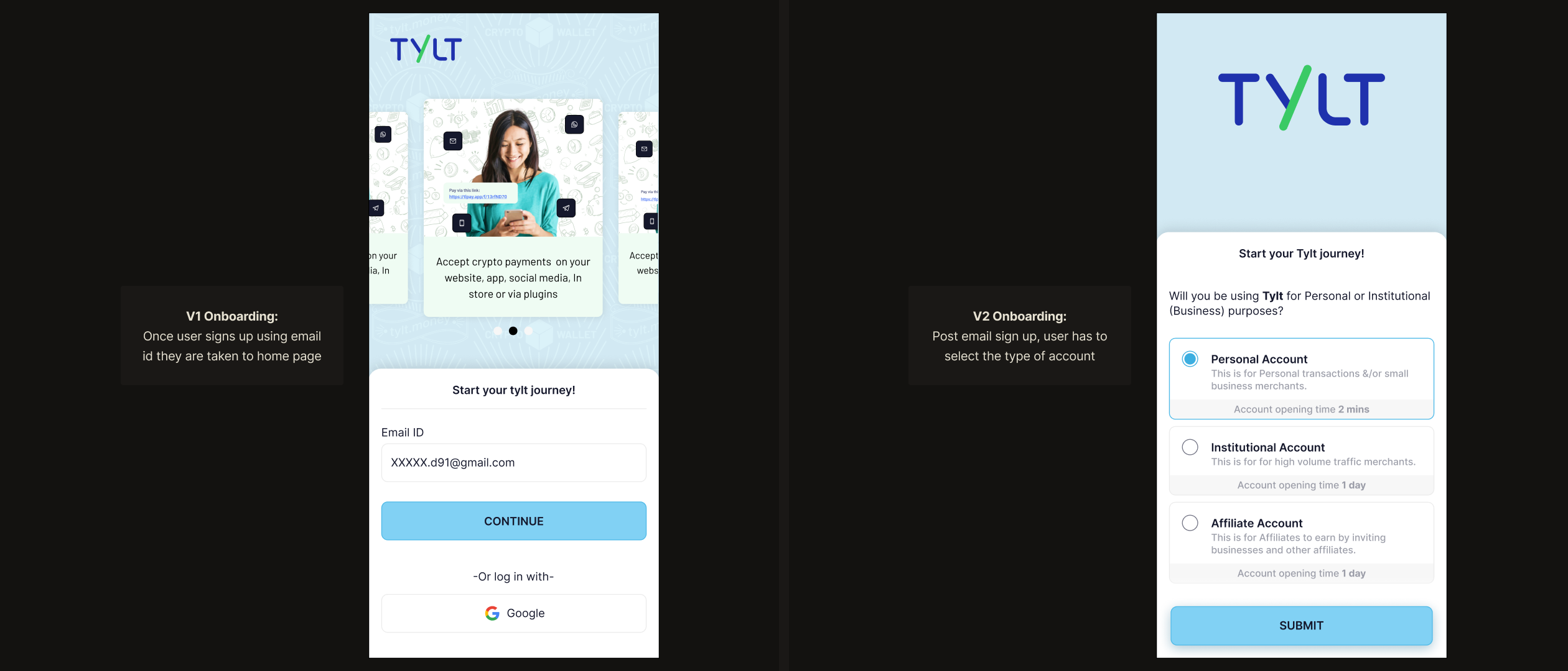
Account type didn't just shape onboarding — it shaped the entire app. The original design had a unified navigation. As we observed user behaviour, it became clear that a single nav was cluttered for some and incomplete for others. The fix: role-based home pages. Institutional users saw CPG, CrossRamp corridors, and operational tooling. Retail users saw personal wallet, P2P, and contacts. Personal wallet and P2P were constant across retail, cashier, and affiliate accounts — only role-specific tools like cashier access or affiliate access appeared conditionally. The same interface, shaped by who was using it.
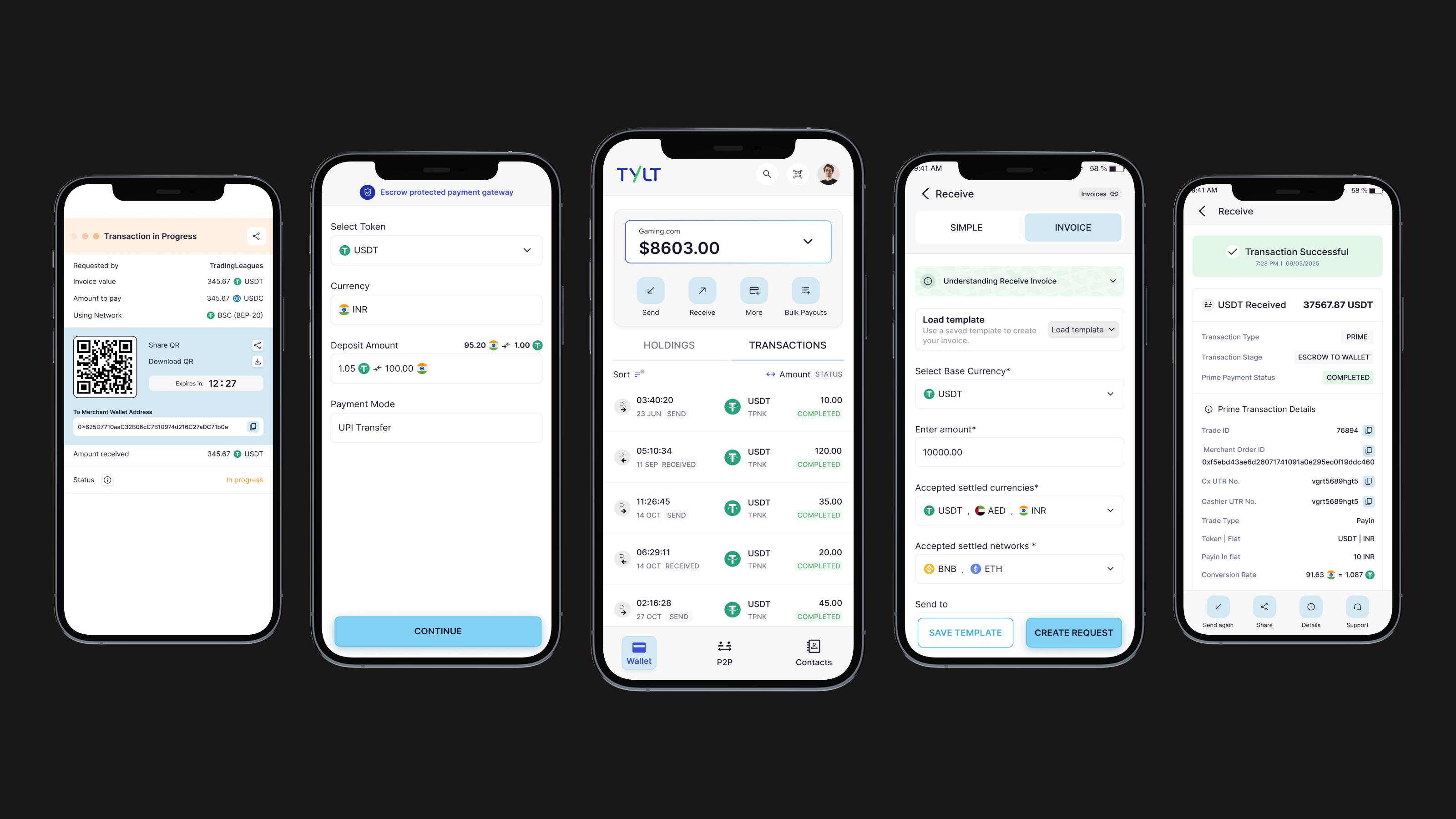
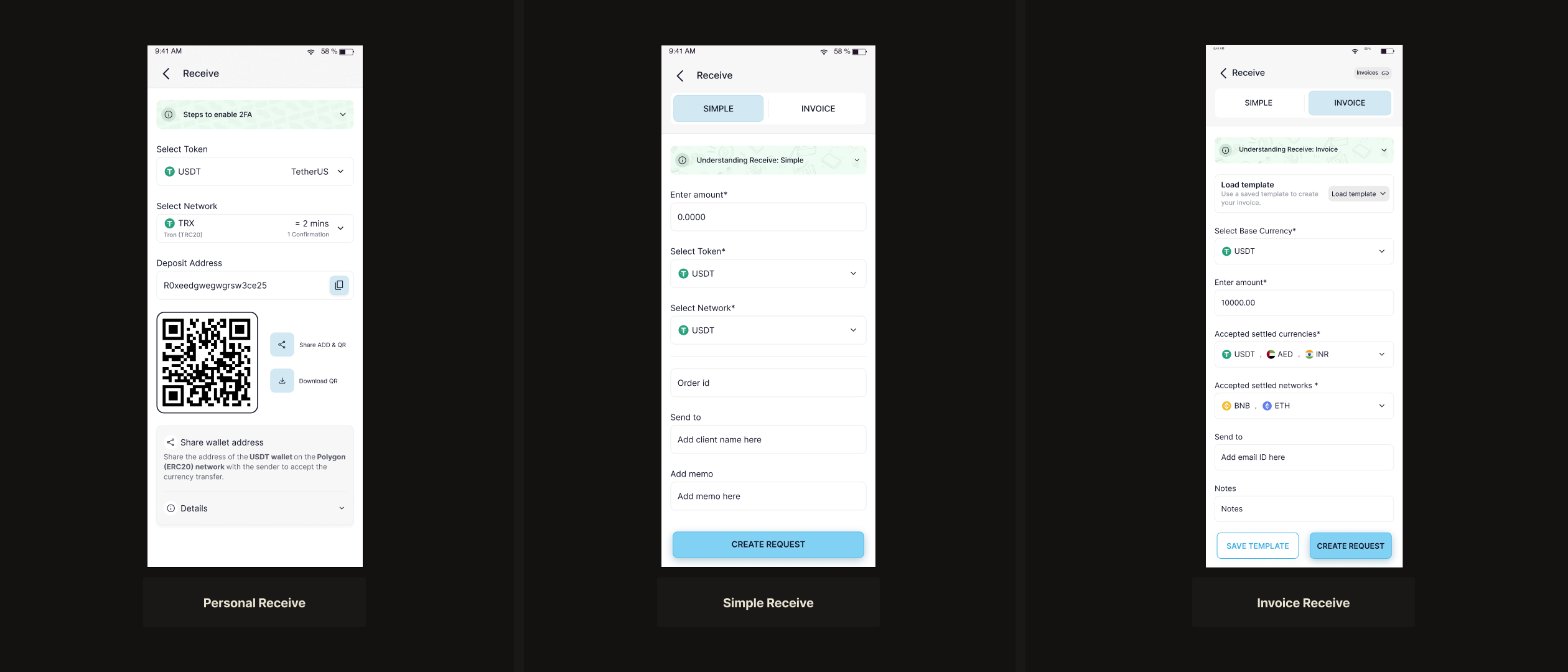
Receive — from QR code to full invoice control
Select token and network, share a QR code. No amount field. The foundation — built for simple crypto receipt between individuals.
Amount added. Order ID and customer email fields. Payment link generated alongside QR. Built for merchants needing transaction context, not just a wallet address.
Full control: base currency, accepted settlement currencies, networks, recipient, notes. Only once received can the customer select their preferred currency — then pay.
The key variation between Simple and Invoice: in Simple Receive, the merchant sets the amount and the customer pays it directly. In Invoice Receive, the merchant defines the accepted currencies and networks — the customer chooses from those options at payment time. One is a fixed request; the other is a configurable offer.
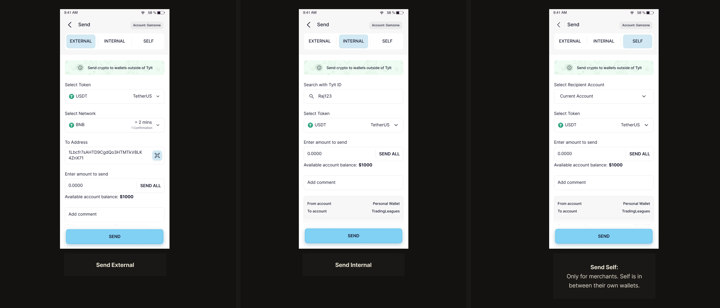
Send — three paths by wallet type
The send flow handles three wallet relationships: external (outside Tylt), internal (another Tylt user), and self (merchant only — moving funds between their own CPG and Current wallets). The self-send option is invisible to non-merchants. Role-based visibility, not separate interfaces.
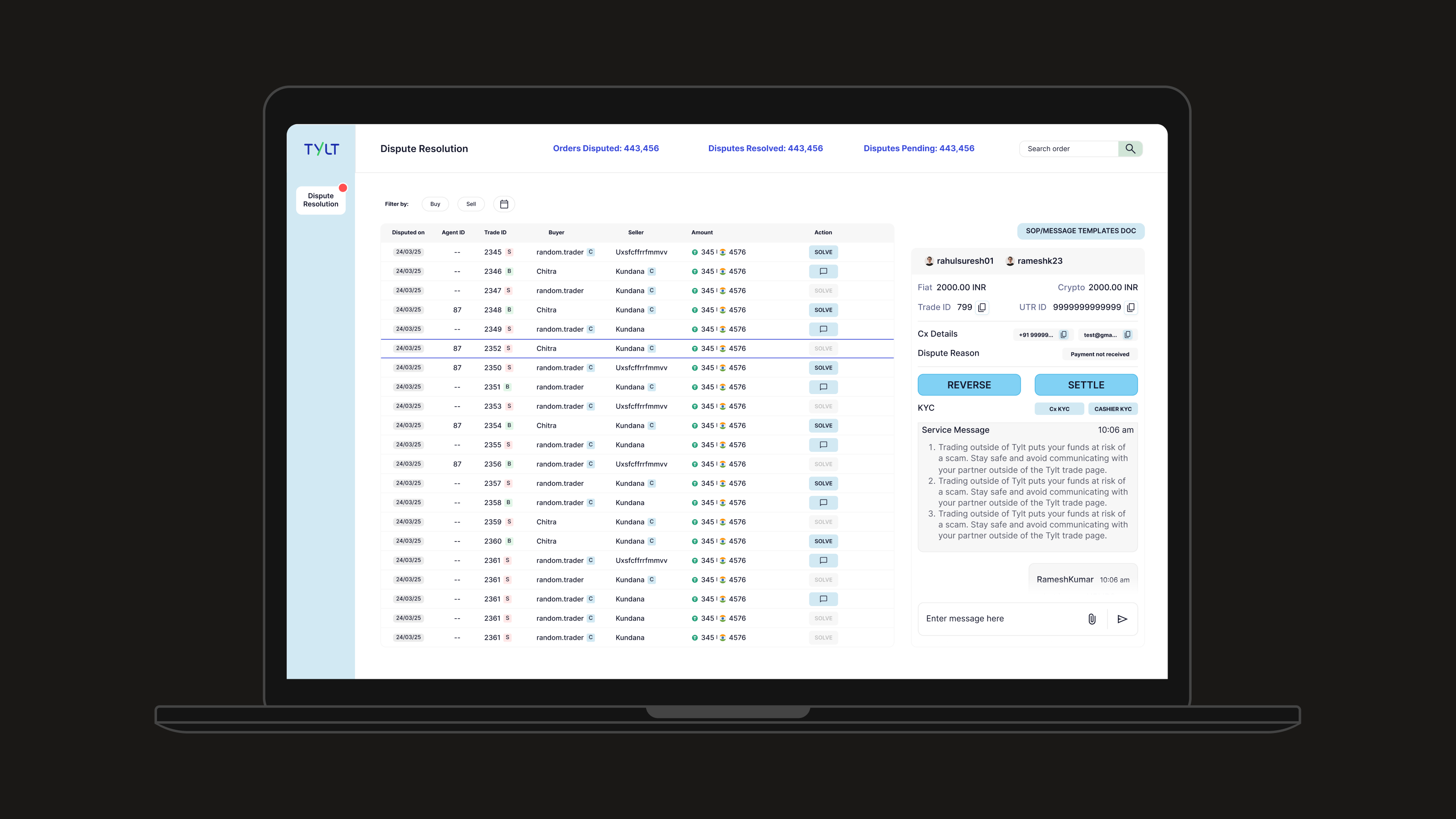
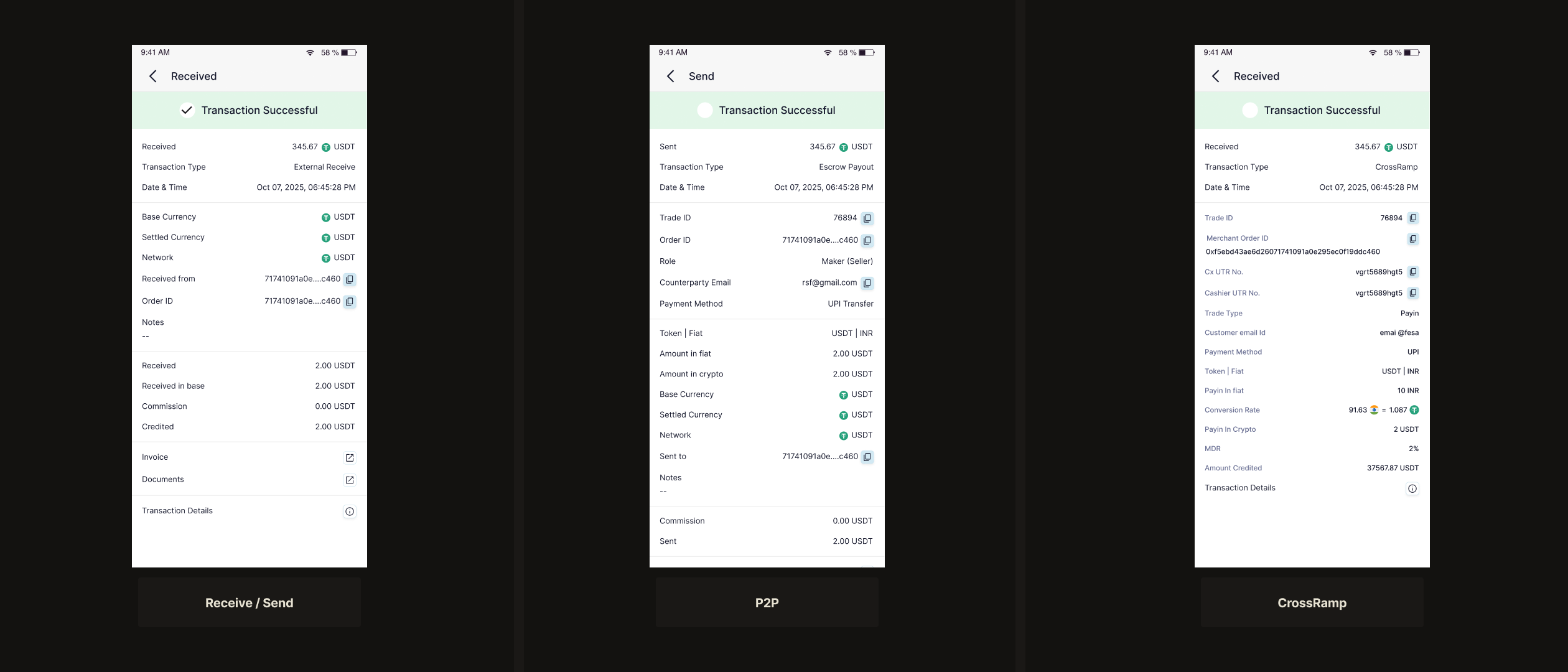
Transaction details — one screen, many transaction types
As the platform grew, the transaction history had to surface an increasing number of transaction types: external send, internal send, self-transfer, simple receive, invoice receive, P2P, CrossRamp, widget payments. Each carried different data — P2P trades show counterparty, price, and trade ID; CrossRamp shows UTR and corridor; invoice payments show order ID, customer, and notes.
The problem: how does a user scanning their history instantly know what kind of transaction they're looking at — and trust that the right data is there? A single flat template would either omit critical fields or overwhelm with irrelevant ones.
The decision: a consistent header pattern anchored by transaction type, with type-specific data sections below. Every detail screen opens the same way — status, amount, type label, timestamp — then expands into the fields relevant to that transaction only. Users learn the pattern once. The system feels coherent even as the data changes. P2P transactions surface a dedicated detail block; CrossRamp transactions surface corridor and UTR; standard sends show address and hash. Nothing irrelevant, nothing missing.
CPG shipped in December 2024. The architecture held. The design language scaled. P2P followed, then five more product surfaces — all built on the same foundation.
The hardest part of 0→1 isn't the design — it's that the brief keeps moving. Founders are still discovering what the product is while you're trying to design it. The instinct is to wait for clarity. The better approach, I learned, is to create it — through IA, through flows, through structured decisions that force alignment before you're ready.
The pushback I'm most glad I made was insisting on structure before aesthetics. There was pressure to show what the product would look like early. I held the line: flows and layouts first, visual design after. It meant the visual work, when it came, had something real to respond to.
What I'd do differently: documentation. In a fast 0→1 environment, design decisions get made verbally and move fast. Better decision logs would have made handoff cleaner and made the product easier to evolve after launch.
Metrics and outcomes shown are directional. Specific figures reflect overall trends, not audited data.