The Idea
Closing a tab feels like losing something. Nobody had solved that.
I had 90 open tabs. The usual responses — ignore it, panic-close everything, install a tab manager — all miss the point. Every existing tool makes saving easier. None of them made closing feel safe.
The real problem isn't the number of tabs. It's that closing feels like a loss, so nothing ever gets closed. Shelf does one thing: forces a decision, once, on each tab.
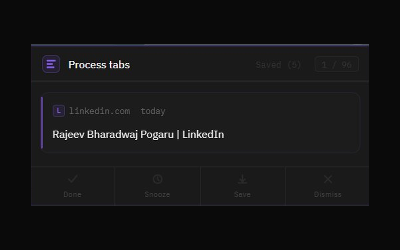
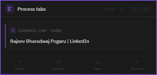
Four honest answers: Done — close it. Snooze — bring it back later. Save — worth keeping. Dismiss — you're never going to read it. That's the whole product.
When the last tab is processed, Shelf shows you a number: how many tabs you cleared in one session. It's a small thing. It feels surprisingly good.
The Brief
1,481 lines written before the build started. All decisions, no code.
Before opening Claude Code, I wrote everything down — what this is, what it isn't, what every interaction should feel like. Not wireframes. A complete brief with enough precision that nothing needed to be invented during the build.
Writing the brief with Claude is different from writing it alone. The model surfaces edge cases and asks the questions you'd otherwise skip. The cut list was as important as the feature list. No AI suggestions layer. No settings page. No new tab replacement. No cross-device sync. Writing them down forced me to see that none of them tested the only assumption that actually mattered: will people triage if the flow feels right?
01
What it is — and what it's not
The product philosophy came first: why this version, and what's explicitly being left out. Every cut is a decision you don't have to undo later. 13 things to build, 8 explicit exclusions.
02
Visual direction: one reference, fully defined
Dark, violet, flat — no nested boxes. One clear aesthetic reference named in the brief so nothing had to be guessed during the build. The visual language was a design decision, not a style preference tacked on at the end.
03
Four interactions with distinct emotional meaning
Each action needed to feel different from the others. Done slides right — finished. Dismiss slides left — released. Snooze pulls back diagonally — moved to later. Save folds away — kept. These weren't animation rules. They were intent, written out before anything moved.
04
Every edge case answered in advance
What happens when there are no tabs? What if a snoozed tab is already closed when the alarm fires? What if you dismiss the last tab? Twelve scenarios — all handled in the brief so the build never had to guess.
The Build
Three words. Working extension in 45 minutes.
I sent the brief to Claude Code and that was it. One session. Everything in the brief came out the other side working — all four actions, all the views, the snooze reminders, the saved list, the animations. No gaps to fill, no decisions to make mid-build, because every decision had already been made.
The brief did what a good brief always does: it made the execution fast and the output predictable.
Directing It
Everything I changed started with something I noticed.
The 18 exchanges weren't debugging — they were product refinement. I used the extension. Saw something that didn't match what I had in my head. Described it. It changed. Most loops took under 2 minutes.
01
“curved radius is not coming properly”
Four words and a screenshot. The extension was blending into Chrome's dark UI — no sense of depth or boundary. I described what I saw, not the fix. The fix came back right: a violet border, a subtle glow, better contrast. Visual feedback resolved it faster than any amount of written explanation.
02
Five changes in one message
Card shape, saved items not persisting, snoozed items needing their own tab, the date picker, animation timing — all noticed in the same session, sent in one message. All five changed at once. The brief had established enough context that batching feedback was as reliable as sending one thing at a time.
03
“timer UI looks messed up”
I didn't know what was wrong — only that it looked broken. Chrome was rendering a mobile scrolling wheel instead of a simple time input. I described what I saw. The element was replaced entirely with something that rendered correctly. A fix I wouldn't have known to make — and didn't need to.
04
Two rounds on the card radius
“Remove border radius only from the main tab card.” I meant the outer popup container. It went on the inner card. Both were reasonable readings of the same sentence. Two rounds to get there. Not a failure — the product was being discovered through conversation, and the ambiguity was mine.
18 exchanges total. The most complex single fix — adding the snoozed list tab, custom date picker, and reworking the animation timing — was one message and one reload.
What It Proved
I made more decisions. Not fewer.
The shift isn't “AI writes the code.” It's “I make every decision, AI handles execution.” Without implementation time between each decision, the decisions come faster and stay sharper. Writing a tight brief wasn't overhead — it was the design work. The build was just executing it.
↑
What stayed with me
The core insight — closing should feel like progress, not loss. What to build and what to cut. Every visual call, every interaction direction, every edge case. The brief was the design document. Claude helped build the product. It didn't conceive it.
↓
What I handed off
Writing it out. Implementation details. Context-switching between design thinking and making things. The gap between a decision and seeing it in the extension: under 2 minutes, every time.
Two weekends minimum to build this without AI assistance. One weekend — working extension in the Chrome Web Store — with it. The spec-first discipline is what made that possible.
Chrome ExtensionSpec-firstSide buildApril 2026